Identity for a software development company
Brand design, web design, creative direction
freelance, 2026
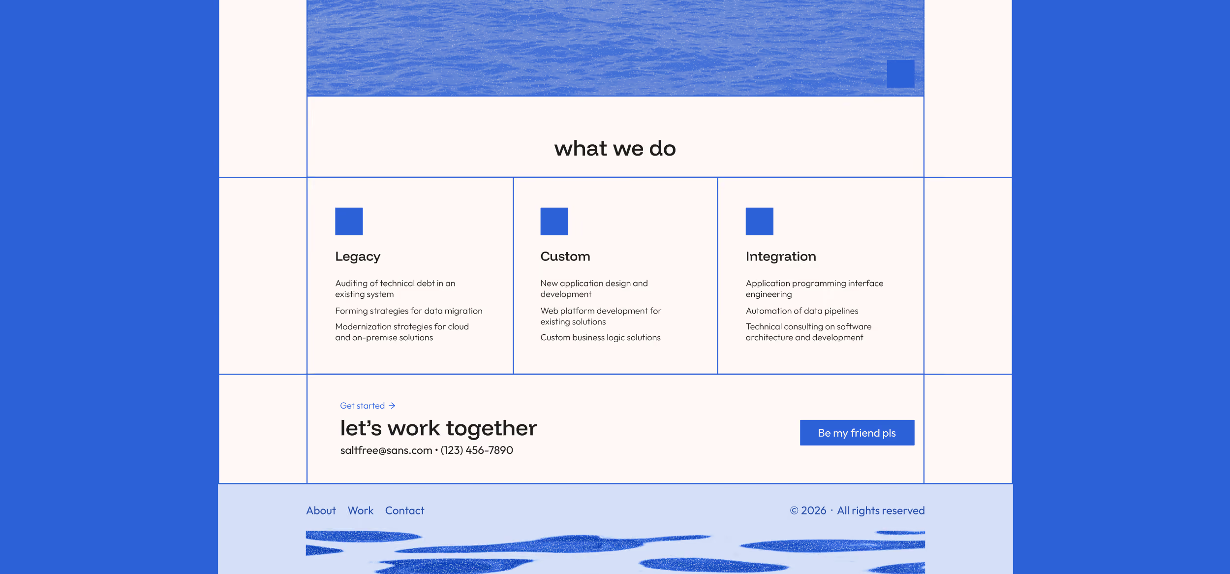
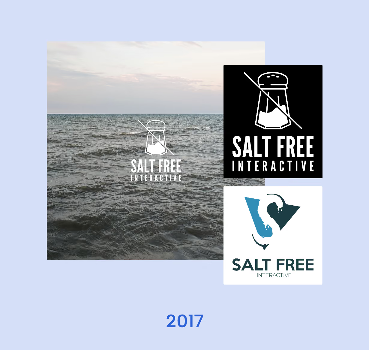
This local software development company was in dire need of a complete visual identity to match the quality of their technical work, as well as their bold personality. While their previous branding was much more literal, we collaborated to find common ground to identify something that felt credible and modern without leaning on any generic clichés.The task at hand: brand identity, a portfolio website, and a lightweight design system to keep everything consistent and adaptable as the company grows.
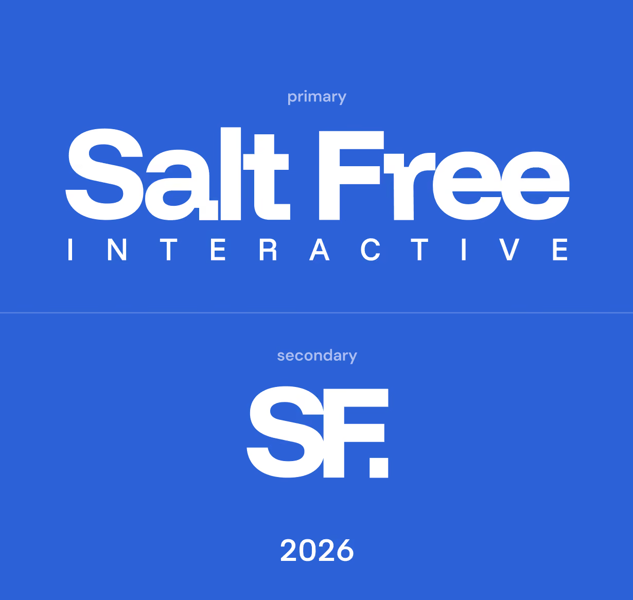
Salt Free Interactive, pays homage to their home state of Michigan’s Great Lakes. While exploring potential ideas and iterating typography, I was posed with an interesting challenge to create something that favored the concept of salt, and also the absence of it. The chunky serif-style treatment of the word-mark, and its blocks resembling chunks of salt is what led Funnel Display to being the top font choice, along with some intentional adjustments. This chunky style is carried through in the secondary version of the logo as well, as a confident period mark.
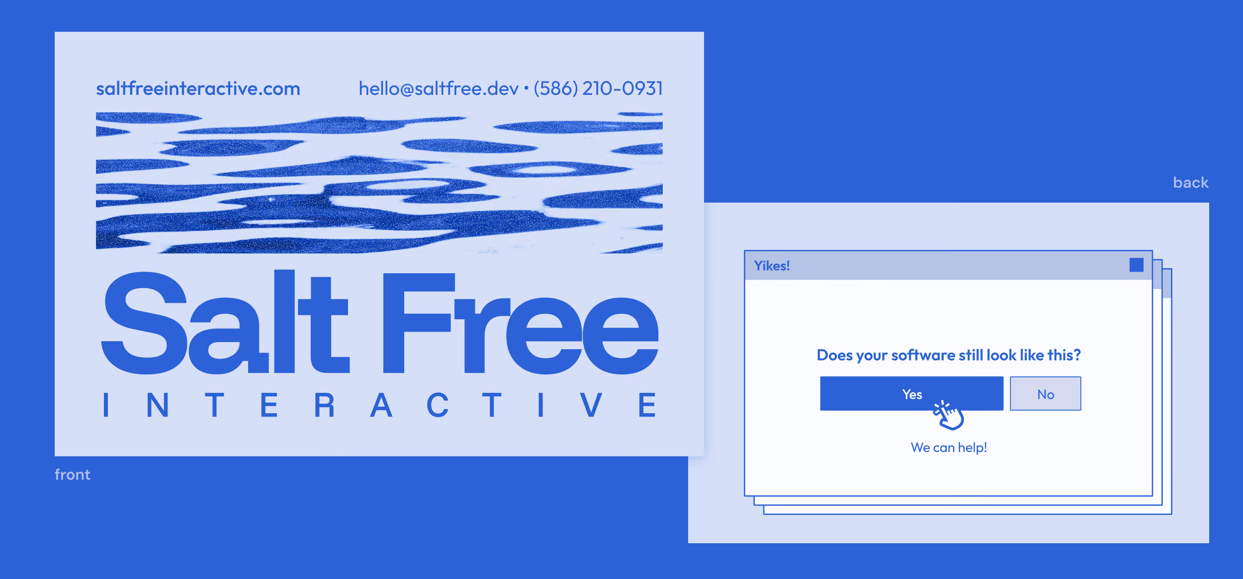
Something the client mentioned that intrigued me was playing around with the irony of a printed branding style for a company that provides strictly digital services. As a lover of print design, it was a breeze finding a nice balance of practical, bold, and a unique printed style to be used throughout the website and other brand materials.
Salt Free Interactive was eager to launch, and operated under a tight deadline. In just a few weeks, I was able to redefine brand identity, iterate, design, design a website, and business cards, all complete with an organized component system. Process meetings were held with the client throughout the process, to make sure the product was on the right track, and were able to keep up with new and incoming adjustments.